


Benefits of the Doherty Threshold in UX Design
-
- Improved User Engagement – Faster response times prevent frustration and keep users actively interacting with the system.
- Increased Productivity – Users can complete tasks more efficiently without unnecessary delays.
- Enhanced Perceived Performance – Even if actual processing takes longer, UI tricks like loading animations or progress indicators can create the illusion of speed.
- Reduced Abandonment Rates – A laggy experience leads to drop-offs, but meeting the Doherty Threshold encourages users to stay and complete tasks.
How to Implement It in UX Design
-
- Optimize load times to stay below 400ms.
- Use asynchronous loading for smoother interactions.
- Provide instant feedback (e.g., button states, loading indicators).
- Minimize unnecessary delays in form submissions and transitions.
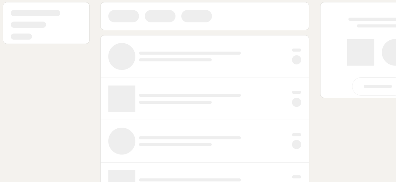
LinkedIn displays skeleton previews while loading content, keeping users engaged rather than staring at a blank screen.

By aligning with the Doherty Threshold, UX designers can create more responsive, intuitive, and user-friendly experiences that keep users engaged and satisfied.