The real question is: Why aren’t users finding these resources? Are they struggling to locate relevant articles?
Join me as I walk through my process of solving this problem.
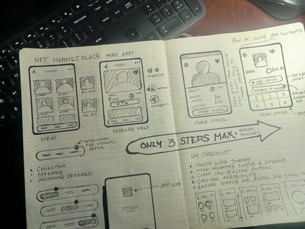
Use case creation
Here are two use cases to kickstart the process and define the problem to solve.
Asking the right questions is key.
Use cases are essential in UX design because they bridge the gap between user needs and design solutions. They keep the focus on solving real problems, not just making interfaces look good.

Research about User behaviour
I used to rely on intuition and best practices when making design decisions. But I quickly learned that what I thought would work often didn’t match how real users actually behaved. That’s when I realized, UX research isn’t optional; it’s essential.
Understanding how users think, behave, and interact with a product is the foundation of great design. Without research, we’re just making educated guesses. I’ve seen projects go off track because teams made assumptions instead of gathering real data. Over time, I’ve come to appreciate how UX research on user behavior uncovers pain points, validates ideas, and leads to designs that truly solve problems. Here’s why it’s so important:

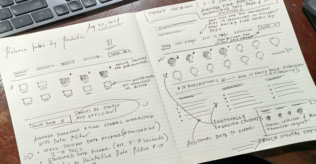
Attacking the problem
Proactively identifying, analyzing, and solving a user experience challenge. It’s about digging deep into the root cause rather than just addressing surface-level symptoms.

For me, attacking the problem starts with asking the right questions. Why is this happening? Who’s struggling? What’s stopping users from getting where they need to go? I’ve worked on projects where what seemed like a simple UI issue turned out to be a deeper problem with navigation or unclear wording/messaging. Here, simply adding the word “BILLING” to a CTA increased its click rate, directly addressing a key pain point.

I’ve also realized that research is non-negotiable. Watching real users interact with a product always reveals something unexpected. I’ve seen users struggle with flows that seemed obvious to me, proving that designing for users means designing beyond our own perspective.
Attacking the problem isn’t just about fixing what’s broken, it’s about getting to the root cause and designing solutions that truly work. That’s what separates good UX from great UX.
Visualize success
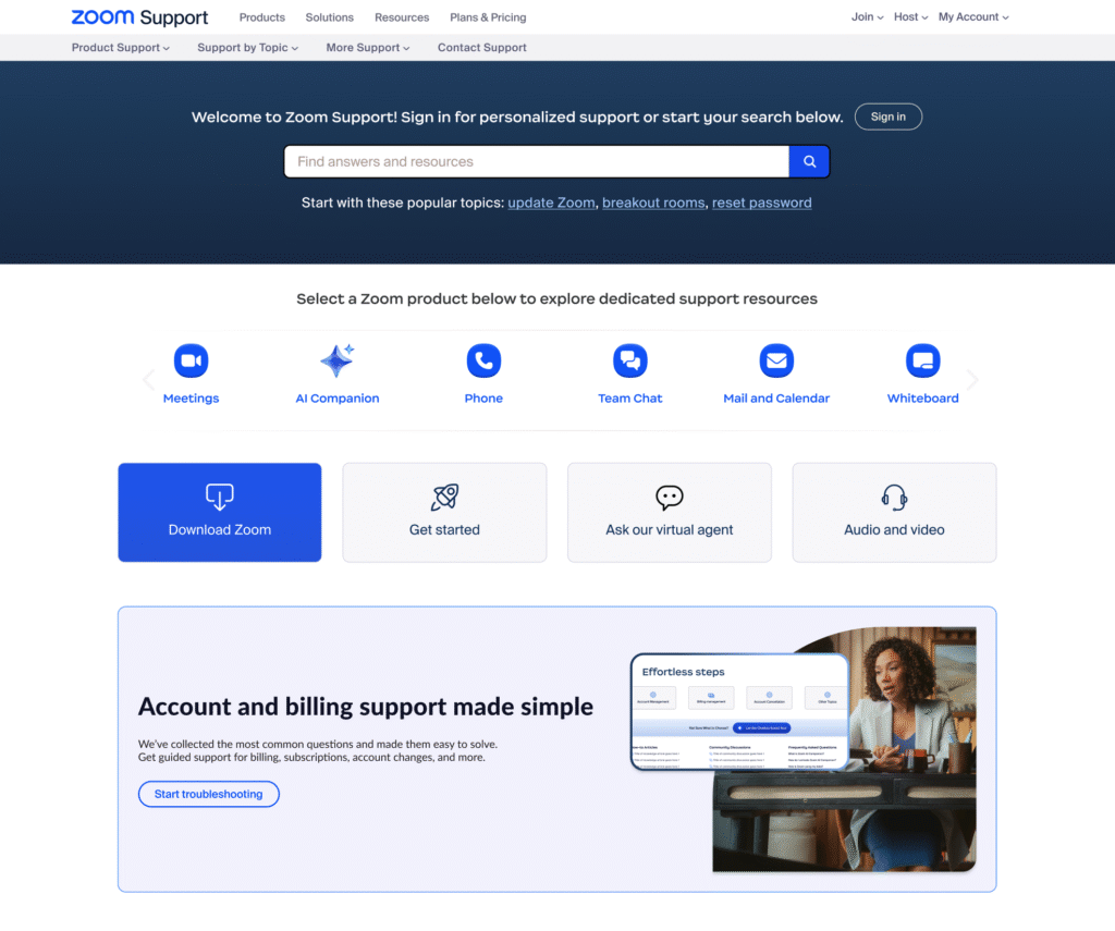
We discovered a lot of issues, which led us to redesign both the homepage and the target landing page for account and billing-related resources.
Based on our research and data, we are confident that we will achieve our KPI.
From this

To this

What I Learned from the Process
Working on this project taught me a lot about how small UX decisions can create big problems, or big improvements. The issue seemed simple at first: users weren’t finding the self-help resources they needed, leading to a flood of unnecessary support tickets. But digging deeper, I realized the real problem wasn’t the lack of resources, it was how users were guided to them.
Here’s what I took away from this process:
- Clarity is everything. Users don’t have time to guess. A single word change in a CTA—like adding “Billing”—can dramatically increase engagement.
- Navigation matters more than we think. If users can’t find the right path quickly, they won’t stick around to figure it out.
- Data tells the real story. Assumptions are dangerous. User behavior, heatmaps, and support feedback showed me exactly where the friction points were.
- UX is problem-solving, not just design. A beautiful interface means nothing if it doesn’t help users achieve their goals.
This experience reinforced that great UX isn’t about making things look good, it’s about making things work. And sometimes, the most impactful solutions come from the smallest tweaks.