Problem to Solve
PS01
This format is very annoying for users because they see the banner repeatedly every time they visit the site.
PS02
This banner looks like part of the website. Even though there is an "X" (close button), users may not click it because they might think it is part of the website design.
PS03
This format may lead to various user frustrations, such as:
Divided attention – Distracting users from their primary task
Visibility issues – Important content may be obstructed.
Navigation difficulties – Making the site harder to use.
Divided attention – Distracting users from their primary task
Visibility issues – Important content may be obstructed.
Navigation difficulties – Making the site harder to use.
Design Solution
I used an in-app banner design to mimic the native app functionality for our web app.
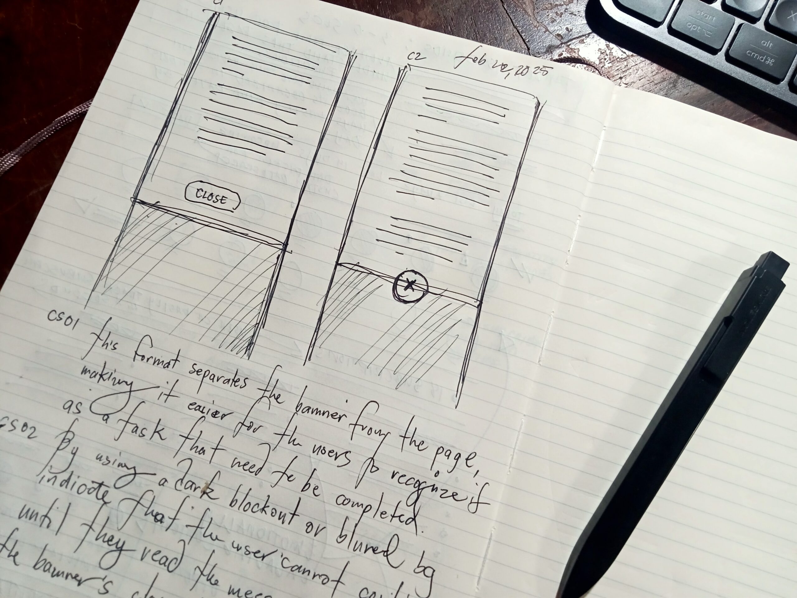
CS01
This format separates the banner from the page, making it easier for users to recognize it as a task that needs to be completed.
CS02
By using a dark blockout or blurred background, we can indicate that the user cannot continue until they read the message and click the banner's close button.
CS03
This format prevents users from experiencing the same banner repeatedly every time they visit the page.


